30+ users were interviewed, each have varying selling experience across Super Kirana or any other apps in the same category. The idea of the questionnaire is to keep it...
- Be open-ended: Let users talk freely.
- Encourage stories: “Can you give me an example?” reveals deeper insights.
- Avoid leading questions: Asked what they do, not why they like your product.
- Record (with consent): Used Zoom for transcription.
- Structured
- Expert
- Remote
- Contextual
For better insights, questions were mapped to the seller journey:
Onboarding → Listing → Selling → Fulfilling → Getting paid → Tracking performance → Getting support
Empathy map is used in design thinking to gain a deeper understanding of a user's perspective, thoughts, feelings, and behaviors, helping to identify their needs and motivations.
Helped team understand user needs, behaviors, and motivations.
Provided insights to inform design decisions.
Helped teams communicate user insights effectively, especially to stakeholders.
Encouraged teams to "get inside the heads" of users.
- Found out that most of the users were in a highly confused state as to which catalogue/products to share to their customers.
- It was easy for sellers to close deals for products which were latest, new in the market.
- Customers search new products, which in return let the sellers to put efforts to research and figure out from other external sources
Everyone, I interviewed is conscius about selling prices at the, thereby selling at on very small margin to sustain in the long run.
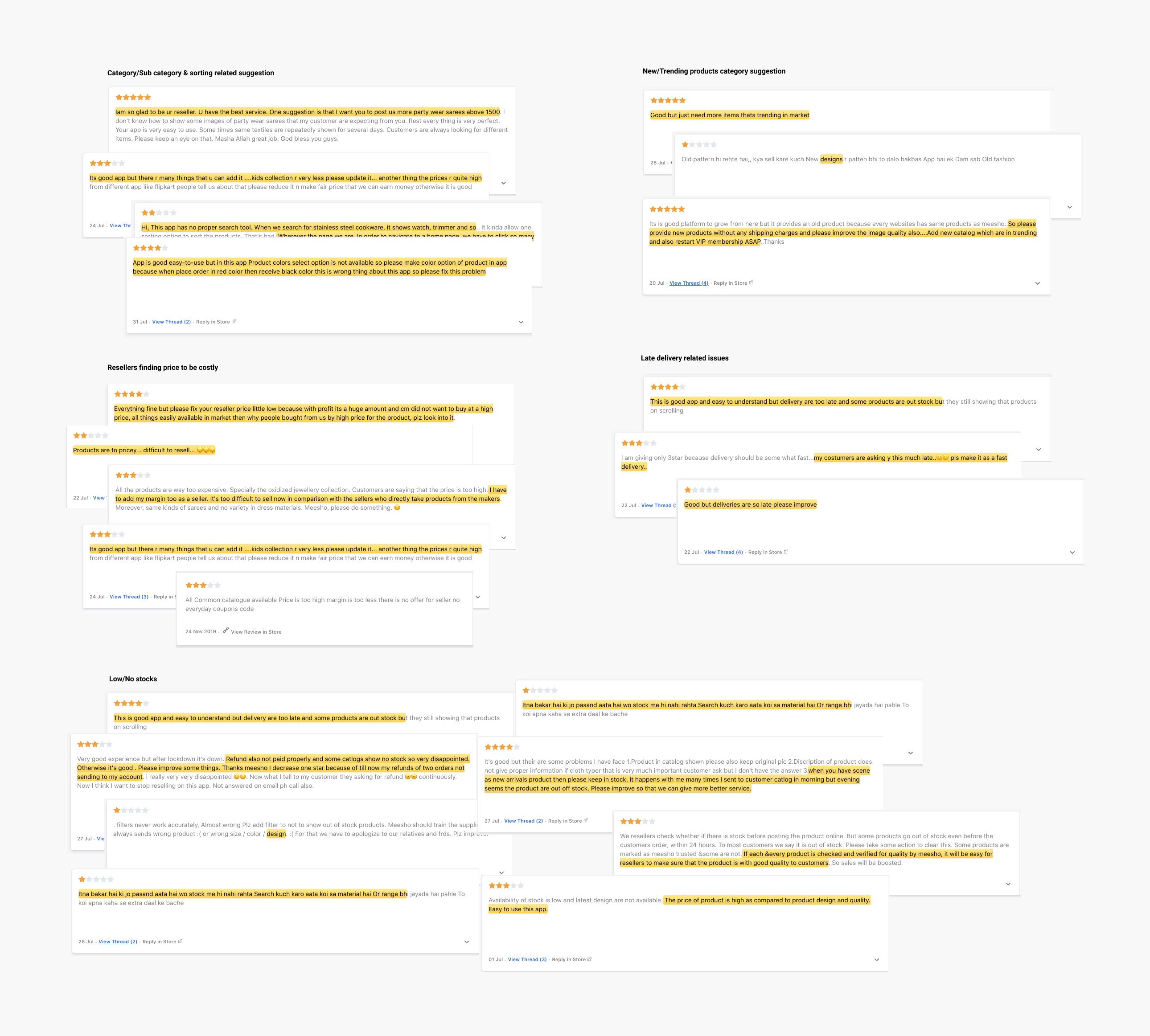
Several Google Play Store reviews re-iterates the key findings, found during my user interview phase.
While doing this, I purposefully held off sending Surveys consisting of questionnaires. Though the target group for Kirana Max were mostly belonging from Tier 1, 2, & 3 cities, but they weren’t habituated to clicking on an online link to answer that many questions. Instead, they will be very comfortable to answer those if someone else asked them those questions over on call or in - person (preferably in their native mother tongue).
Due to my time constraint, I chose to go for the App Review analytics to do my quantitative research which will give a statistical data - the problem faced by actual Kirana Max users. It’ll quantify the problem by way of generating numerical data that can be transformed into usable statistics. It is also widely used to quantify attitudes, opinions, behaviors, and other defined variables - and generalizing results from a larger sample population.
Methods
Out Comes
This is the process of reviewing a product’s implementation to ensure that the final build matches the intended design specifications before release. It’s like the final “pixel detective” stage—making sure the vision in Figma doesn’t get lost in translation when developers bring it to life.
Done QA before the release candidate is finalized, saved rework time. Prioritized critical UX defects over pixel-perfect fixes when deadlines are tight. Kept a version-controlled QA doc so issues aren’t lost in chat threads. Paired with developers during the QA pass for faster iteration.
New & Imaginative Ideas. View things in new ways. Generate new possibilities and alternatives. Solution is guaranteed.
People talk a lot about and I do it, that make my Client feel proud. It makes the Brand easier to remember and for longer time.
It turns a very ordinary thing into more Attractive one. Kind of a magic it works like but not an illusion.